Tutorial 2: Gentium's o
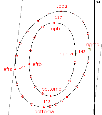
The o in Gentium Italic presents us with a slightly more complex task than the period. The glyph shape itself is more complicated, and the distances we need to regulate are less standardized. Here is the glyph as it appears in FontForge: we have added names for the points that will have to be explicitly positioned and distances (in font units) for the stems that will have to be regulated.
|
Notice that the distances at the top and bottom of the glyph do not quite match; the same is true of the left and right. In fact, all of the lower-case letters with curves somewhat like that of o (a, c, d, e, g, etc.) have curves of slightly different widths. In a font of the quality of Gentium, it would be a mistake to assume that this variation is inadvertent; rather, Victor Gaultney was presumably aiming for optical rather than mathematical consistency in his glyph outlines. What is true of the stems is also true of the sidebearings: the left sidebearings of the lower-case letters with rounded left sides are slightly different.
These minor differences can cause problems at low resolutions, where a difference of a single pixel can make a character look lopsided, or too bold, or too thin. At the same time, we want to preserve the differences at higher resolutions, as on good laser printers or imagesetters. This is not really a problem for us, since the control-value cut in is intended to handle precisely this kind of situation. We need only to choose a standard width for these curved stems; if we make sure that the cut-in is always used, our standard width will be used at low resolutions and the designer's widths at high resolutions. We can experiment with the standard width and with various settings for the cut-in at any time.
The x-height and the distance of the bottom point of a rounded lower-case glyph from the baseline are consistent in this font. We will add the following control values to the ones we defined for the period:
    <control-value name="x-height" value="936"/>
    <control-value name="lc-round-char-bottom" value="-41"/>
    <control-value name="lc-vert-round-stem" value="143"/>
    <control-value name="lc-horz-round-stem" value="115"/>
    <control-value name="lc-round-char-left-side" value="55"/>
And we will get ready to write the glyph program by creating the <glyph> element and defining constants for the key point numbers:
    <glyph ps-name="o">
      <constant name="last" value="47"/>
      <constant name="topa" value="43"/>
      <constant name="topb" value="3"/>
      <constant name="bottoma" value="30"/>
      <constant name="bottomb" value="13"/>
      <constant name="lefta" value="35"/>
      <constant name="leftb" value="8"/>
      <constant name="righta" value="0"/>
      <constant name="rightb" value="20"/>
    </glyph>
For the o, we will nest <move> elements, building XML structures to correspond to the visible features of the glyph: the four rounded stems at the left, right, top and bottom. Remember that when we nest a <move> inside a <move> element, the point moved by the parent <move> is implicitly the reference point for the child <move>. Here are the horizontal and vertical moves:
    <with-vectors axis="x">
      <move distance="lc-round-char-left-side">
        <reference>
          <point num="left-sidebearing"/>
        </reference>
        <point num="lefta"/>
        <move distance="lc-vert-round-stem">
          <point num="leftb"/>
        </move>
      </move>
      <move>
        <reference>
          <point num="lefta"/>
        </reference>
        <point num="rightb"/>
        <move distance="lc-vert-round-stem">
          <point num="righta"/>
        </move>
      </move>
    </with-vectors>
    <with-vectors axis="y">
      <move distance="lc-round-char-bottom">
        <point num="bottoma"/>
        <move distance="lc-horz-round-stem">
          <point num="bottomb"/>
        </move>
      </move>
      <move distance="x-height">
        <point num="topa"/>
        <move distance="lc-horz-round-stem">
          <point num="topb"/>
        </move>
      </move>
    </with-vectors>
    <interpolate-untouched-points/>
First we position point lefta relative to the left-sidebearing point (defined in the last tutorial as a global <constant> dependent on point last). Then we position point leftb distance lc-vert-round-stem from lefta. We do the same with the right side of the glyph, but this time we start by positioning point rightb relative to point lefta, and then we work from the right side of the stem to the left. By omitting a distance attribute from the outer <move>, we accept, but round, the design width of the glyph. Later, if we find that one or more other glyphs in the font are the same width as the o, we can add a <control-value> for that measurement and a distance attribute here.
For the y axis, the operations are similar to what we did on the x axis. Here, however, we omit the reference points and position points <bottoma> and <topa> at absolute positions on the grid. If we go on writing instructions for this font, we will use the control values x-height and lc-round-char-bottom so frequently that it will make sense to round them in the <pre-program>, saving the TrueType engine the trouble of rounding them over and over while executing glyph programs. So we add these lines to the <pre-program>:
    <round value="x-height"/>
    <round value="lc-round-char-bottom"/>
And we add attributes round="no" and cut-in="no" to the two outer <move> elements. (We don't need the cut-in with such standard measurements; and for technical reasons it makes sense to turn off rounding and the cut-in at the same time.) Now the glyph program for o looks like this:
    <glyph ps-name="o">
      <constant name="last" value="47"/>
      <constant name="topa" value="43"/>
      <constant name="topb" value="3"/>
      <constant name="bottoma" value="30"/>
      <constant name="bottomb" value="13"/>
      <constant name="lefta" value="35"/>
      <constant name="leftb" value="8"/>
      <constant name="righta" value="0"/>
      <constant name="rightb" value="20"/>
      <with-vectors axis="x">
        <move distance="lc-round-char-left-side">
          <reference>
            <point num="left-sidebearing"/>
          </reference>
          <point num="lefta"/>
          <move distance="lc-vert-round-stem">
            <point num="leftb"/>
          </move>
        </move>
        <move>
          <reference>
            <point num="lefta"/>
          </reference>
          <point num="rightb"/>
          <move distance="lc-vert-round-stem">
            <point num="righta"/>
          </move>
        </move>
      </with-vectors>
      <with-vectors axis="y">
        <move distance="lc-round-char-bottom" round="no" cut-in="no">
          <point num="bottoma"/>
          <move distance="lc-horz-round-stem">
            <point num="bottomb"/>
          </move>
        </move>
        <move distance="x-height" round="no" cut-in="no">
          <point num="topa"/>
          <move distance="lc-horz-round-stem">
            <point num="topb"/>
          </move>
        </move>
      </with-vectors>
      <interpolate-untouched-points/>
    </glyph>
And now the <pre-program>, which we began to construct in the last tutorial, looks like this:
    <pre-program>
      <round value="period-height"/>
      <round value="x-height"/>
      <round value="lc-round-char-bottom"/>
      <control-value-delta>
        <delta-set size="11" distance="-8" cv="period-height"/>
      </control-value-delta>
    </pre-program>
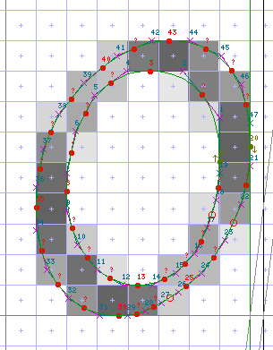
At 20 pixels per em, the grid-fitted glyph now looks like this:
|
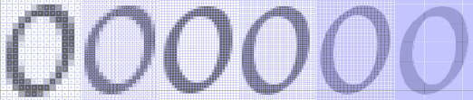
And here is how it looks at various resolutions from 30 ppem to 200 ppem. The pattern of pixels corresponds more closely to the original outline as the resolution goes up:
|